The Company
Leaf is known to be nature that is why i chose to make a 3 leaf as a logo. I made 3 of them to rep- resent the siblings who make the business. As you can see it can also be used as a butterfly. The leaf represents as the wings of the creature and the body would be the hyphenated part of the “Eâ€. Normally Butter- flies have 2 wings. As you can see this butterfly is special, It has 3 wings if you look closely. it just goes to show how special our business is. I chose the color green because of nature. it also gives your mind comfort and also good luck. Green also shows good health and fortune.
The whitening part here in our logo is the backgroud. As you can see the logo is much better with the white background, it could not go with red, it could not go with yel- low, It is justthe white background that goes with this logo because it shows whitening, cleanliness, and putiry. And the greens will tell them how exo freindly our busi- ness is.
As you can see the color of our NU is different with the color of the TRIEL. It could show the whitening part. But the truth to that is. when you say NU it’s like NEW. It shows that our business is NEW.
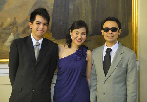
The siblings who started the business NutrieÌl (From left to right) Kyle Nisce, Katrina Nisce- Anisco, Karlo Nisce.